Save thousands of dollars and weeks of headache and generate a customized website in just 30 seconds using you phone.
Top 10 Principles of Usability in Website Design
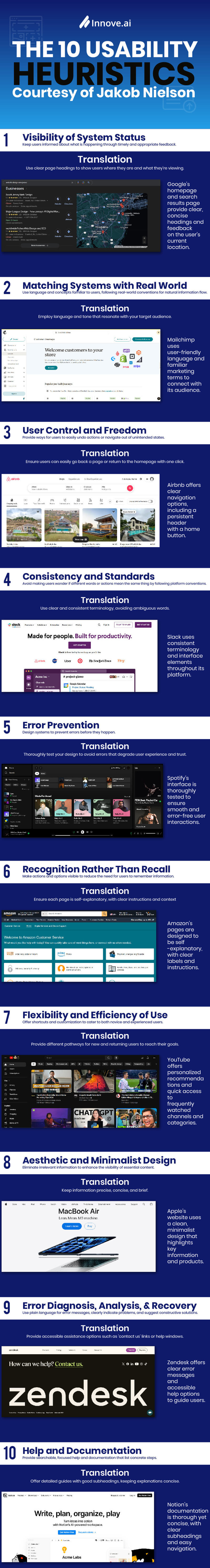
When it comes to design, we always need to be concerned with the usability of it. If it looks great, does an awesome job of marketing your products, or functions in new and exciting ways. None of that matters if there isn’t a high degree of usability. This term, ‘usability’ is often defined by the ‘Ten Usability Heuristics’ by Jakob Nielson:
While these do apply specifically to ‘user interface design’, let’s try to give them some context so they make some more sense, before we dive into the how-to below. Ready?
These are all great things to bear in mind as key ideas for your site, but they don’t answer a lot of questions–namely how you should design your website to begin with - they just say what it should do by the end. Though, don’t worry, because below, you’ll find what you’re looking for.
Core design, however, is a double edged sword. In that people hate it when things are the same, but also despite change in equal measures, which is displayed above. Your site has to do those things (like everyone else’s) to be usable.
It’s up to you, then, to reinvent the wheel. To give users something fresh, while maintaining a high degree of usability. Why is usability so important? Glad you asked.
1. The Three Second Rule & ‘F’ Rule of Eye Tracking
Within three seconds of landing on your page, users will decide whether or not they’ll stay or leave. The way that the human eye works, and how we process what we see, can either work for, or against you. There’s the classic ‘F’ shape of eye movement, wherein users’ eyes move horizontally across the top, then bounce back to the left margin and scan vertically, moving off the margin when they hit headings or pictures.
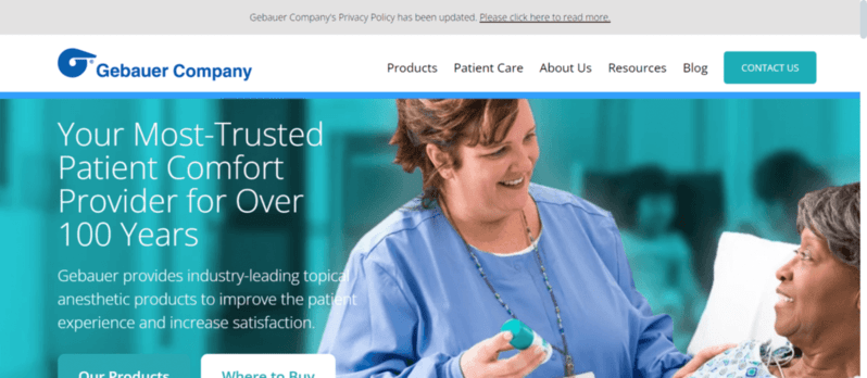
A great example of this is Gebauer Company which put all of their key information in the left. Your eyes hit the logo, the menu pages, and then land right on their sub-heading: ‘Your Most-Trusted Patient Comfort Provider for Over 100 Years’.
Because of the way that most websites have developed, this has become a natural process for us to follow by way of something called ‘Learned Behavior’, though we’ll touch on that in a moment.
The question now becomes whether or not the ‘F’ shape works for, or against you. Does it restrict you from designing a website however you please? Yes. But, does it allow you to design your website with a good basis of knowledge as to how people will view it? Also yes. You can, then, exploit this.
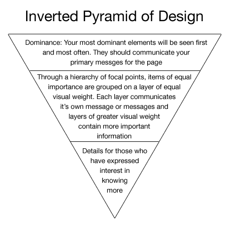
2. The Inverted Pyramid of Design
The Inverted Pyramid of Design is a permutation of other ‘Inverted Pyramid’ theories, which all state that the biggest, boldest information at the top of the page should be the most important and that the broadness and importance of the information dwindles as it descends. By extension, your most important targets for clicks or reading should be big, bold, and at the top of the page. The ‘F’ shape eye tracking pattern supports this too
The Pyramid states that within the first second of landing, users should immediately recognize where they are on a page, and where they need to go. Perfection would be that fits inside that three second bounce window.
If we can keep them for ten seconds, they should then understand the primary message of the page.
If they stay for two minutes, the secondary message should be getting through. This is all great to know, because it fits in with the ‘F’ shape. Logo at the top in the header, then a big bold heading/slogan that delivers the brand/page message.
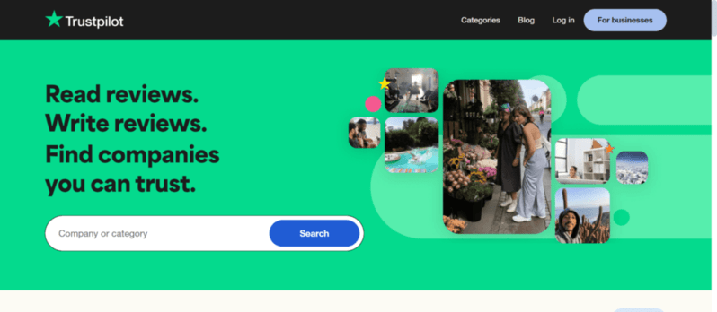
Take TrustPilot, for example: When you land on their page, you get everything you need in the first few seconds. ‘Review and discover companies!’ is the brand message. Subheading: ‘Read reviews. Write Reviews.
Find Companies you trust.’--what the page does. This is a simple and effective example of the Inverted Pyramid. It delivers concise, to-the-point information that can’t be missed.
“In one second the user should understand generally where they are —largely driven by visuals and functionality. If we can keep people for 10 seconds, they should understand our primary message. If they stay for two minutes, some secondary messages should be getting through. All this feeds into a call to action.”
— Kristina Halvorson
3. Three Click Rule
The three click rule is simple in terms of usability. It states that a user must be able to navigate to any page/item in your site with three clicks or less. This is a point that’s good to bear in mind as we move through these next points, as they’re all linked.
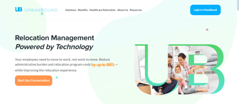
And, a good example of how not to do this is Urban Bound, whose site pushes you continually at the ‘Request a Demo’ button, though, when you click it, you’re taken off-site and can’t get back without using the browser-back button. Not a good design move. And, with lots of long pages and no bottom menu, despite looking great at first glance, they haven’t considered the usability of their site as they should have.
4. Fitts’ Law
Fitts’ Law is a mathematical equation that calculates the time it takes for a user to see, recognize, and close in on a target. We don’t mean a target as in an actual target, but a goal, an item, or anything like that. It can be applied to anything from finding an item on a supermarket shelf, or finding the right icon to click on a website. Using your knowledge of the Inverted Pyramid, and also the ‘F’ rule,
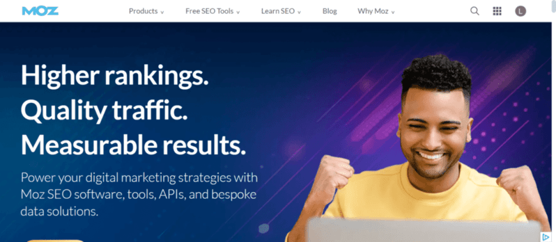
you’ll know exactly where to place the things you want people to see, and click, right? A great example of a design that utilizes these designs is Moz.
They layout their site in a way that’s both easy on the eyes, and perfectly suited to the ‘F’ Rule. Fitts’ Law is appeased too with the target button being ‘Sign Up Now’ and appearing the first place your eyes go. Their brand message and click target are both nestled in prime digital real estate and no doubt capture a lot of users looking for solid web design services.
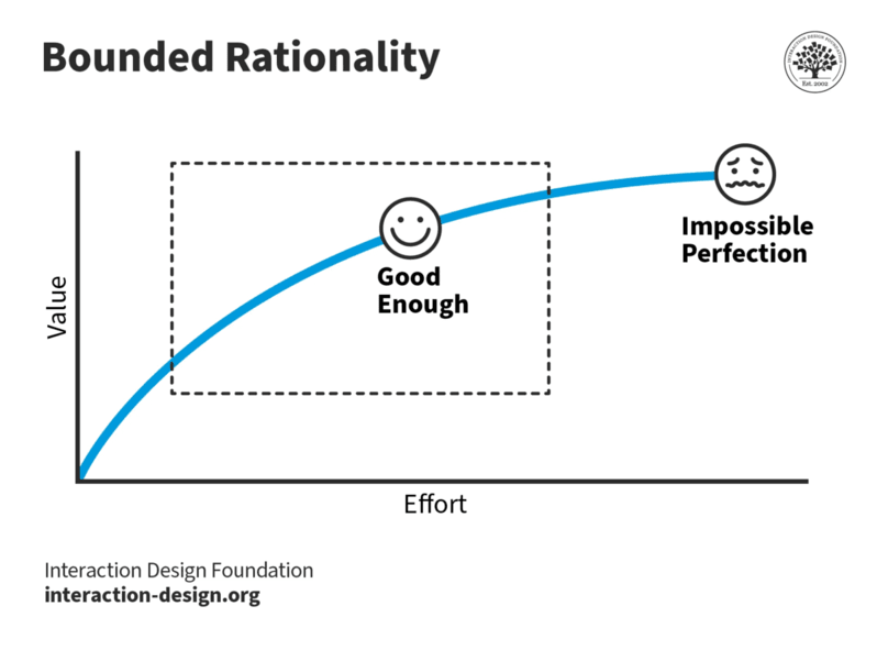
5. Satisficing
Satisficing is an interesting concept. What it asks is that you don’t refine your message too much. If you have a specialty, you reserve it until after a user has been captured. Again, it plays into the whole ‘three second rule’ and the ‘inverted pyramid’ idea. Your brand message and initial information conveyance should be big, bold, broad, and widely encompassing.
Satisficing is basically when something is ‘good enough '. It may not be exactly what you’re looking for, but the idea of navigating back to a Google search and clicking another result is almost too much trouble. Because of satisficing, a lot of companies will capture users with broad terms, and then deviate from them in the body text or nested pages. Why? Because people are more likely to stick with a site they’ve already invested time in. Capturing a user’s attention early is the best way to get hold of a conversion. So, don’t be too specific with your titles or headings.
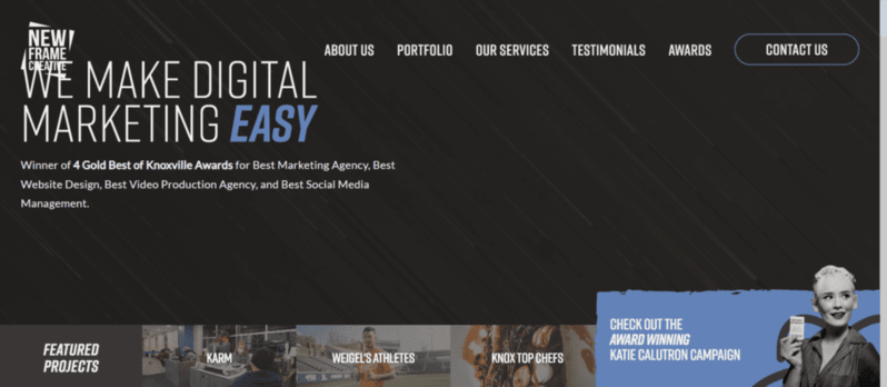
My favorite example of this is Vieo Design. Their message is simple ‘We Make Digital Marketing Easy,” and backed it up with credibility–awards.
At first glance, that sounds great to any potential customer looking to give their business and marketing a boost. But, take a second to reflect on that–is it not the vaguest, most generic marketing promise you’ve ever heard? It encompasses everything from products to services, to nonprofits, to YouTube pages. It can be anything - which is why we chose it as an example here. It does not satisfy, it satisfices. It’s not exactly what you want, but it’s reasonably close, and that will do. Delve deeper, and they start to refine their service descriptions - by which time, they already have you.
6. The 7 +/- 2 Rule
A psychological principle above all else, this rule maintains that the human mind can only keep seven items in working memory. As such, you know that seven is the magic number in terms of page population. The fewer the better when it comes to design, but under no circumstances should you clutter your page with a thousand things, otherwise it’ll become difficult to navigate, process, and ultimately remember. An unmemorable webpage isn’t likely to get much in the way of repeat traffic.
Remember way back in the first point when I mentioned ‘Learned Behavior’? Well, now we’re going to talk about it. What is learned behavior? It’s, again, a simple psychological idea that dictates that through past experiences. We produce preconceptions about things without experiencing them currently. For example, if we come to a door with a handle on it but no sign, we’ll likely pull it because we know that handles are for pulling. Similarly, if it has one of those metal plates, we’d push it. We make this assumption because of learned behavior.
In the same way, we’ll squeeze Avocados in the supermarket to see if they’re ripe. Or, we’ll stop the microwave at one second because we know that annoying beep is coming.
These are all learned behaviors. Things you do based on previous experiences with a reasonable level of certainty as to what the outcome will be.
In design, this applies too. If you click the logo in the header of a website, you expect to be taken back to the home page. If you click a blue phrase or word with an underline, you expect it to be a link. If you click a down arrow next to a title, you expect it to expand out. We expect these things because we’ve been conditioned too.
The reason that Learned Behaviors are so important to keep in mind when designing is because if we deviate from them, we lose leads and users. If a user can’t find a navigation bar in the header, they may simply cast the website aside and go to a different one. If they click a product image and it doesn’t take them to the product, they’ll get frustrated. There are things that are common in every website because they work. That old adage–if it ain’t broke, don’t fix it– runs like a thread through all of life, and it persists through web design too.
Check out these gorgeous websites:
While all are beautiful, colorful, and unique; they all have to conform to the rules of Learned Behavior, or risk annoying their users. So, you can see in each one, different as they are, common factors: Logo in the top left. Big glossy image in the middle. Bold click button in the middle of the ‘F’ path. Nav bar at the top.
These things help users to land, make the snap decision that they know how to work your site, and then concentrate on the content. Why distract and confuse them with something new when this is the tried and true method? Being original is fine, but don’t throw away leads and conversions for the sake of it. You came here looking for advice as to how to build your website. It's like these guys. It works. It really does. Once you’ve got those common elements in place, go wild–but don’t mess with the formula or you’ll only hurt your own figures.